Our Top 5 Go-To Paint Colors
Selecting paint colors for your home is a tricky endeavor – you may see a shade you love online but realize it looks far different in your own space. We’ve tried hundreds of hues in our projects and can wholeheartedly recommend these five fabulous neutrals!
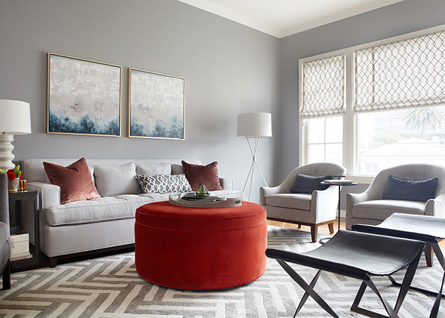
Moody Gray // Benjamin Moore Storm AF-700
Ready for some contrast? A moody gray is a great way to create drama in dining rooms and living rooms, especially paired with crisp white trim.
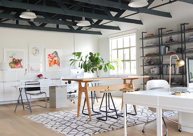
Warm White // Benjamin Moore White Dove OC-17
Searching for a white that isn’t too stark or yellow? You found it! This soft white is perfect for open concept spaces and modern homes where you want the architecture or art to take center stage.

Classic Navy // Farrow & Ball Hague Blue
A deep, intense blue that’s perfect for media rooms and offices or as an accent on front doors or used on cabinetry in bathrooms or kitchens.
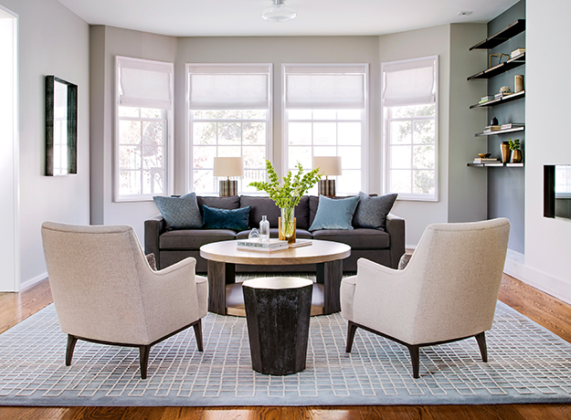
Neutral Taupe // Benjamin Moore Cumulus Cloud 1550
The warm, earthy tones in Cumulus Cloud make it a good choice for cozy and enveloping spaces.
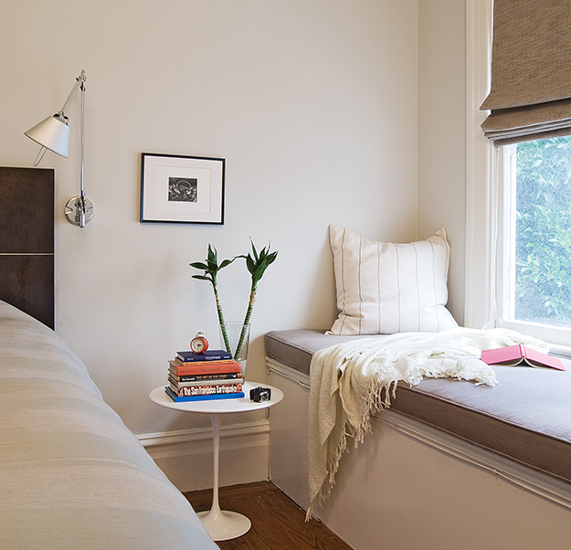
Wispy Gray // Benjamin Moore Moonshine OC-56
Finding the perfect dove gray is no easy feat! Moonshine is a true silvery gray that doesn’t skew blue. We love it in almost any room, but it’s especially calming in bedrooms.
what a wonderful collection of grey tones! I used Benjamin Moore White Dove OC-17. And it turned out amazing. My paintings look perfectly on it.
Love this!